
5 Ways Screenshots Improve Feature Announcements
Tips and examples for improving product screenshots for feature announcements.
Screenshots are one of the most effective ways to communicate new features and product updates. They help users quickly understand what's changed, visualize how a feature works, and reduce the learning curve. To make your feature announcement screenshots more effective, consider the following best practices:
Keep the Interface Clean: Remove unnecessary elements and focus attention on the feature being introduced.
Add Annotations: Add arrows, labels, callouts, or highlights to guide users through important changes.
Highlight Key Elements: Use visual cues such as contrast, focus effects, or subtle highlights to draw attention to critical interface elements.
Add Device Frames and Backgrounds: Present screenshots inside realistic device mockups or attractive backgrounds to create a more professional appearance.
Include Step-by-Step Visuals: Pair screenshots with concise instructions to help users understand workflows and complete tasks more easily.
When done well, feature announcement screenshots reduce confusion, increase engagement, and encourage faster adoption of new functionality. Tools like ShotLab make it easy to create polished screenshots with annotations, backgrounds, frames, and other enhancements that help your updates stand out.
5 Steps to Create Effective New Feature Announcements
https://www.youtube.com/watch?v=VWXSTxPQiGM
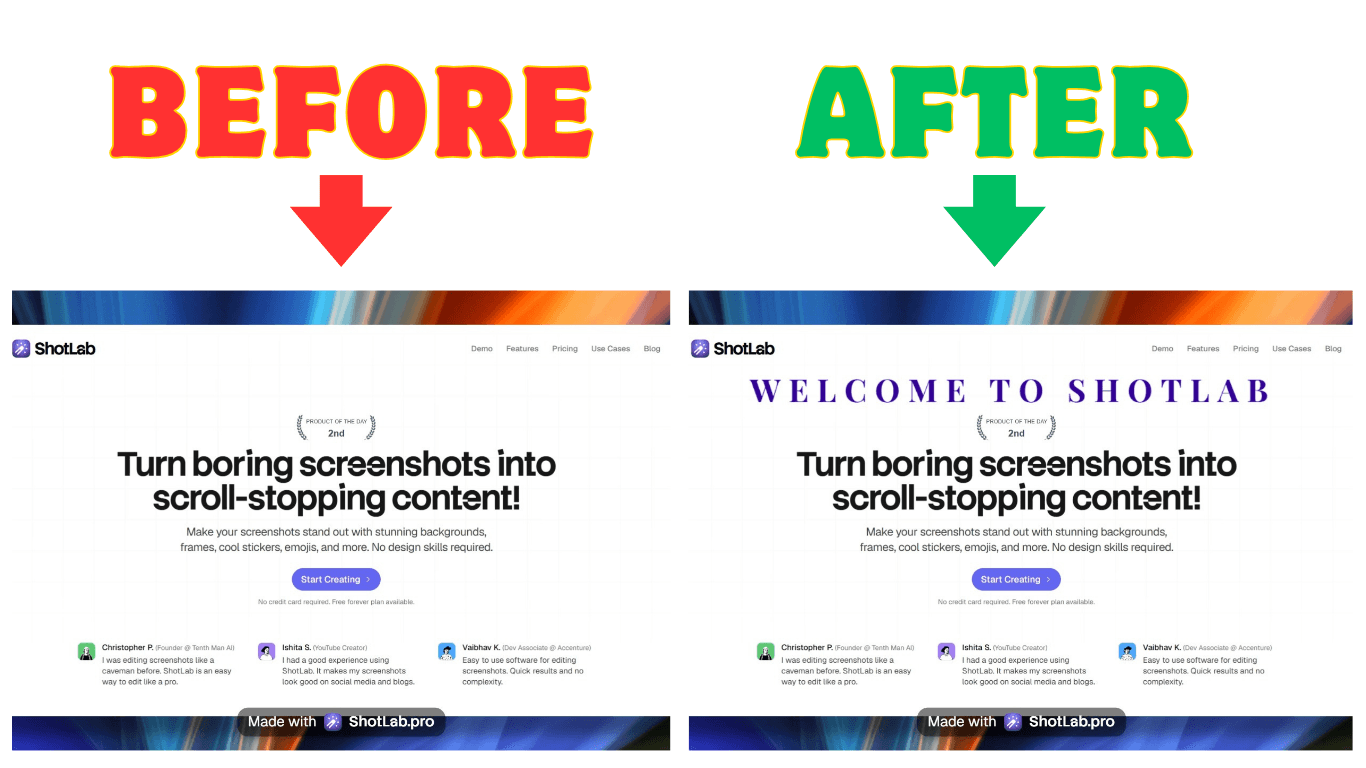
1. Keep the Interface Clean for Focus
A cluttered screenshot can overwhelm users and make it harder to communicate your message. The goal is to direct attention to the feature you're announcing, not every element on the screen.
Think of your screenshot as a visual guide. By removing unnecessary distractions, users can instantly understand what has changed and why it matters. Navigation menus, sidebars, and unrelated interface elements often add noise without providing value.
To create cleaner, more effective screenshots:
Prioritize important elements by visually emphasizing the feature you're showcasing.
Crop strategically to focus on the most relevant section of the interface.
Remove unnecessary UI components while keeping enough context for users to understand where the feature belongs.
The table below can help you determine which interface elements should remain visible and which can be removed based on the purpose of your feature announcement.
| UI Element Type | Keep If | Remove If |
|---|---|---|
| Navigation Bars | They show workflow context | The feature is standalone |
| Side Menus | They demonstrate integration points | The focus is on specific tools |
| Secondary Controls | They explain feature relationships | You're showcasing one function |
While simplifying your interface is important, avoid removing so much context that users can no longer understand where the feature fits within the overall workflow. The best screenshots strike a balance between focus and context, making it easy for users to recognize both the feature itself and its place in the product experience.
Once you've created a clean, focused screenshot, the next step is to make it even easier to understand with annotations.
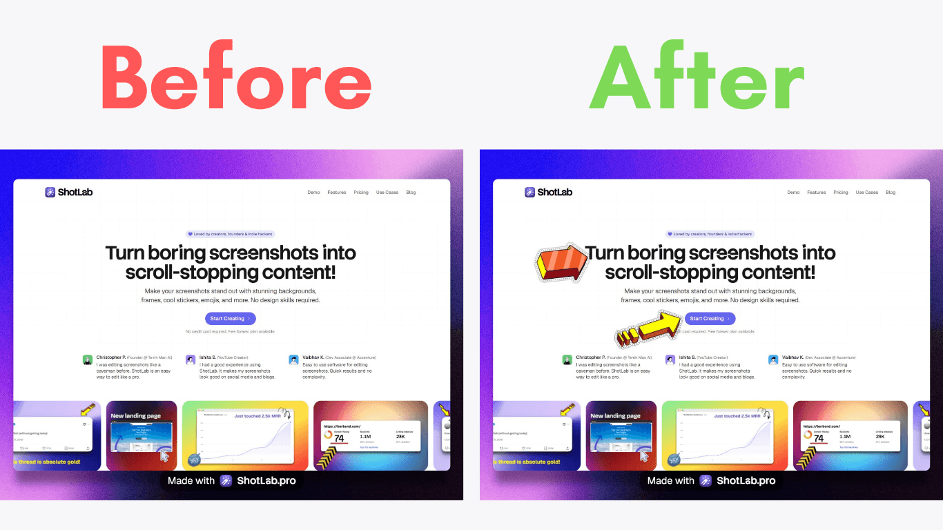
2. Add Annotations for Detail
A clean screenshot provides focus, but annotations add clarity. By using arrows, labels, callouts, and highlights, you can draw attention to important changes and help users understand new features at a glance.
Annotations work by simplifying complex ideas, offering context, and directing users' attention. Here’s a quick breakdown of their most effective uses:
| Annotation Type | Best Used For | Example Application |
|---|---|---|
| Arrows | Showing relationships | Pointing from a button to its resulting action |
| Text Labels | Explaining functionality | Describing what happens when clicking something |
| Highlights | Drawing attention | Marking new or updated interface elements |
| Numbered Callouts | Sequential workflows | Explaining multi-step processes in order |
For instance, Google showcased highlights and labels effectively in their Gemini panel announcement. This made even complex features feel intuitive and actionable.
To keep your annotations clear and effective:
Use contrasting colors to ensure highlights and callouts are immediately noticeable.
Keep annotation text concise and focused on the most important information.
Avoid over-annotating by limiting each screenshot to a few key callouts. Too many annotations can create visual clutter and distract from the main message.
Maintain consistency by using the same styles, colors, and annotation patterns across all your announcement graphics.
Tools like ShotLab make it easy to add arrows, labels, emojis, and other visual cues while maintaining a consistent design across your screenshots.
Once your annotations are in place, the next step is to emphasize the most important elements of your interface so users instantly know where to look.
3. Highlight Key UI Elements
When introducing new features, it's important to draw attention to specific parts of the interface. This helps users focus on what matters most by creating a clear visual hierarchy.
Here are some effective ways to highlight UI elements:
| Highlighting Method | Best For | Impact |
|---|---|---|
| Size and Isolation | Key features | Makes important elements stand out while reducing distractions |
| Color Contrast | Interactive elements | Directs attention to buttons or clickable items |
| Progressive Focus | Multi-step features | Guides users step-by-step through changes or processes |
A common technique used in product launches is to visually emphasize the most important interface element while keeping the surrounding context visible. This helps users immediately identify what's new without losing their understanding of where the feature lives within the product.
To make your highlights more effective:
Focus on a single primary element whenever possible. Highlighting too many areas at once can dilute your message.
Use a consistent visual style across all screenshots to create a cohesive experience.
Prioritize readability so highlighted buttons, menus, or panels remain easy to recognize and understand.
Leverage contrast, spacing, and typography to draw attention naturally without overwhelming the viewer.
ShotLab makes this process simple with custom backgrounds, annotations, and other visual enhancements that help important UI elements stand out while maintaining a polished, professional appearance.
Remember that highlighting should serve a purpose beyond aesthetics. The goal is to help users quickly identify and understand new functionality so they can find and use it confidently within the actual product.
Once you've highlighted the key elements, consider placing your screenshot inside a device frame or adding a subtle background. These finishing touches can make your visuals look more polished, professional, and ready to share.
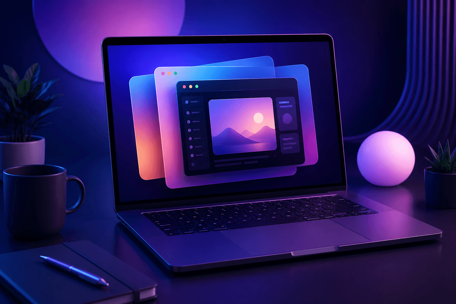
4. Use Device Frames and Backgrounds
Adding device frames and custom backgrounds can make your screenshots look more polished and provide helpful context. This approach not only grabs attention for feature announcements but also shows how your product works on actual devices.
| Frame Type | Best Use Case | Benefits |
|---|---|---|
| Mobile Frames | App updates and mobile features | Displays mobile interface clearly |
| Desktop Frames | Web app features | Shows realistic browser environment |
Device frames and backgrounds can transform a simple screenshot into a professional, attention-grabbing visual. When combined with highlights and annotations, they help create a clear visual hierarchy that guides users directly to the feature being announced.
A well-chosen device frame adds context by showing where the feature will be used, while a subtle background helps separate the screenshot from the surrounding content. Together, they make announcements feel more polished, credible, and easier to understand.
Custom backgrounds can also improve clarity by:
Reducing visual distractions and keeping the focus on the feature itself.
Creating contrast that helps important interface elements stand out.
Reinforcing brand identity through consistent colors, gradients, or design styles.
Making screenshots more shareable across social media, blogs, and product launch platforms.
To get the best results:
Choose device frames that match your audience's devices, whether desktop, tablet, or mobile.
Keep backgrounds subtle so they support the screenshot instead of competing with it.
Use appropriate frame sizing to ensure important UI details remain clearly visible.
Maintain consistency across all announcement graphics to strengthen your brand presentation.
ShotLab includes a library of frames, backgrounds, gradients, and canvas presets, making it easy to create professional-looking feature announcement graphics in just a few clicks.
If your feature works across multiple devices, consider showcasing screenshots from different screen sizes. This helps users understand how the experience adapts across desktop, tablet, and mobile environments.
Once your screenshots are polished and visually appealing, the final step is to pair them with clear, step-by-step guidance that helps users put the feature into action.
5. Include Step-by-Step Visuals
Screenshots are excellent for showing users what a feature looks like, but combining them with step-by-step instructions helps users understand how to use it. This approach turns passive visuals into actionable guidance, making it easier for users to adopt new features with confidence.
Breaking a workflow into clear, manageable steps reduces confusion and helps users achieve success faster. Instead of guessing what to do next, users can follow a structured path that walks them through the feature from start to finish.
When designing step-by-step guides with screenshots, focus on these three elements:
| Element | Purpose | Best Practice |
|---|---|---|
| Visual Flow | Direct user attention | Use arrows and highlights to connect actions with results |
| Text Clarity | Provide clear actions | Write concise, action-focused instructions |
| Screenshot Focus | Highlight key details | Crop images to emphasize the most relevant parts |
A great example of this approach is Buffer. Their platform uses floating elements and progressive UI to simplify complex publishing workflows. Each screenshot is tied to a specific action, making it easier for users to follow along and adopt features step by step [1].
To create more effective visual guides:
Break workflows into clear, manageable steps, with each step supported by a screenshot that illustrates the action being performed.
Maintain consistent annotation styles throughout the guide to create a cohesive and professional experience.
Use user feedback and analytics to identify confusing areas and continuously improve your documentation.
Keep instructions concise, focusing only on the information users need to complete the task successfully.
For more complex workflows, consider following a simple structure:
Start with an overview screenshot that introduces the feature and provides context.
Walk through each step sequentially using annotated screenshots.
End with a success state that shows users what the completed outcome should look like.
When combined thoughtfully, screenshots and step-by-step instructions can dramatically improve user understanding, reduce friction, and accelerate feature adoption.
Conclusion
Using the five methods we’ve covered, product teams can make it easier for users to understand and adopt new features. Since visuals are processed much faster than text, screenshots are a must-have tool for effective communication.
| Method | Impact | Key Advantage |
|---|---|---|
| UI Simplification | Eases mental effort | Keeps users focused on what matters |
| Detailed Annotations | Improves clarity | Adds context without confusion |
| Element Highlighting | Boosts feature visibility | Directs attention to key functions |
| Device Framing | Makes it relatable | Puts features in a real-world context |
| Step-by-Step Guides | Simplifies onboarding | Breaks down complex features |
These techniques work together to transform ordinary screenshots into powerful communication tools. By creating a visual story around your feature announcements, you can make even complex functionality easier to understand, helping users discover value faster and adopt new features with confidence.
The right tools can make this process significantly easier. With ShotLab, you can quickly enhance screenshots using annotations, highlights, frames, custom backgrounds, and pre-sized canvases for platforms like Product Hunt, X, Reddit, and more. This allows teams to create professional, consistent visuals without spending hours on design work.
The ultimate aim? Helping users connect with your features through clear, engaging visuals. Well-designed screenshots not only simplify complexity but also keep users interested and engaged, paving the way for better feature adoption.
Related posts
5 Best Screenshot Tools to Capture, Beautify, and Share Stunning Visuals in 2026